Designing Memorable Event Posters
In today’s fast-paced digital world, event posters may seem like a thing of the past. However, when done right, they can still be an effective way to attract attention and create a lasting impression. Whether you are promoting a small local event or a large-scale concert, designing a memorable event poster is key to stand out from the crowd and attract a diverse audience. Here are some tips to help you create compelling event posters that leave a lasting impact.
1. Know your audience: Before you start designing your event poster, it’s important to have a clear understanding of your target audience. Consider their preferences, interests, and demographic to create a design that resonates with them. Your poster should communicate the essence of your event and appeal to potential attendees.
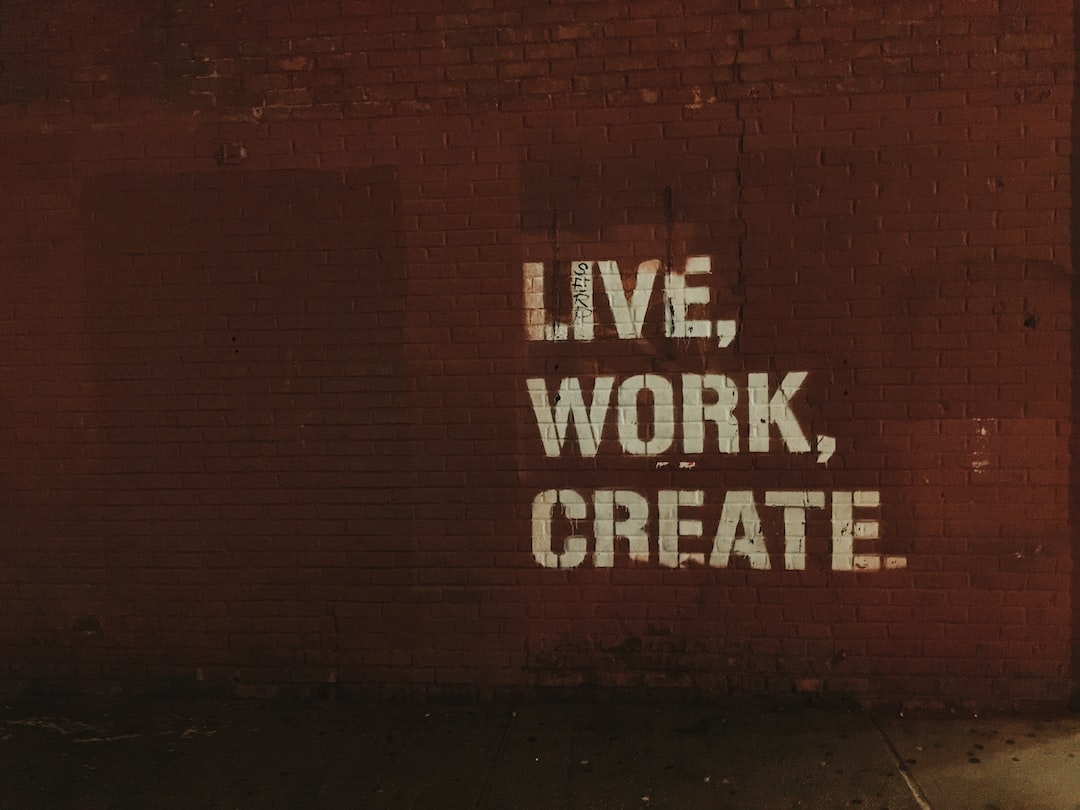
2. Start with a strong headline: The headline is the first thing people will see on your event poster, so make it captivating and informative. Use bold and eye-catching typography to grab attention and make it easy to read, even from a distance. Keep it concise, but ensure it conveys the key details of your event, such as the name, date, and location.
3. Use striking visuals: Visuals are powerful tools to grab attention and evoke emotions. Incorporate visually appealing graphics or high-quality photographs related to your event theme. Make sure the images are relevant and create a sense of intrigue. The colors you choose can also have a significant impact on the overall impression. Pick a color scheme that complements your event and conveys the desired mood.
4. Keep it simple and uncluttered: When it comes to design, less is often more. Avoid overcrowding your event poster with excessive information or graphics. Stick to the essential details and make sure they are easily readable from a distance. Leave enough white space to allow the design elements to breathe and create a clean and professional look.
5. Choose the right typography: The fonts you choose can greatly influence the overall feel of your event poster. Opt for fonts that are legible, but also reflect the mood and theme of your event. Experiment with different font combinations to create a visually interesting hierarchy. Avoid using too many different fonts as it can make your poster look messy and confusing.
6. Incorporate branding elements: If you are organizing a recurring event or representing a brand, it’s important to include branding elements in your poster design. This can include logos, colors, or taglines that are associated with your event or organization. Consistent branding helps build recognition and credibility among your target audience.
7. Experiment with different layouts: Don’t be afraid to think outside the box and experiment with unconventional poster layouts. Explore different ways to arrange your text and visuals to create a unique and captivating design. However, make sure the layout is still easy to follow and understand.
8. Add a call to action: A call to action is essential in any promotional material, including event posters. Encourage people to take action by including clear instructions such as “Buy tickets now,” “Register online,” or “Visit our website for more information.” This will provide a clear next step for interested individuals to take.
In conclusion, designing a memorable event poster requires a strategic approach. By understanding your audience, incorporating compelling visuals, and maintaining a clean and effective design, your event poster will stand out from the rest and leave a lasting impression. Remember to keep it simple, yet striking, and include a clear call to action. With these tips in mind, you are well on your way to creating event posters that captivate and engage potential attendees.
